
Start With a Client
When a reader is new to Nostr, the first useful route is not the full archive. It is one good client, one clear identity model and one safe next step.
The first route should be narrow
A new reader does not need 500 app links on the first click. They need one narrow route that answers: where do I start without making a key mistake? A client is the right beginning because it makes the network visible. The wrong client choice can make Nostr feel empty, unsafe or too technical before the idea has a chance to land.
Start with a client that matches the reader. Apple users may test Damus or Nostur. Android users often encounter Amethyst. A reader who wants a polished consumer surface may start with Primal. A reader who wants more control can inspect Coracle or noStrudel. A builder may open a web client and a raw tool side by side.
The point is not to crown a winner. It is to make the first hour humane.
What to check in the first hour
The first hour should teach four things: the app is a window, the key is identity, relays affect what appears and a signer can protect the private key. If a client teaches those gently, it is doing useful onboarding. If it hides them completely, the reader may feel comfortable but remain fragile.
A good first client should let the reader follow people, post a note, see profile identity, understand whether a signer is being used and avoid feeling stranded in an empty feed. It should not force them to understand every relay setting before they can breathe.
After that, the reader can compare a second client. The comparison is where Nostr starts to click.
Why the client comes before the directory
A giant directory is impressive only after the reader has a mental model. Before that, it is a shelf of unknown names. Starting with a client gives the reader a concrete loop: create or connect an identity, follow someone, read a feed, post a small note, open a profile, maybe send a zap, then compare the same identity elsewhere. That loop turns Nostr from an abstract protocol into a thing a person can feel.
The first client should not be chosen because it has the loudest fan base. It should be chosen because it matches the reader’s device, explains key handling, gives enough relay defaults to avoid an empty room, and does not hide every important decision. A smooth client is good. A smooth client that teaches nothing can become confusing when the reader switches products.
That is why this route card belongs before the deeper shelves. The reader needs one working window before they can judge signers, wallets, media tools or developer pages.
The first comparison should be gentle
A good first comparison is not a feature spreadsheet. It is a simple lived test. Open one polished client and one more protocol-visible client. Look at the same profile. Follow the same account. Search for the same note. Read the relay settings. Try a NIP-05 name or an npub. See what feels portable and what feels app-specific.
That comparison teaches the central Apps lesson: Nostr products are windows with opinions. The network is not the app, but the app determines whether the network feels understandable.
What the first client teaches that a directory cannot
A directory can show the size of the ecosystem, but it cannot teach the feeling of using a portable identity. The first client teaches that by making the same key visible as a profile, a follow list, a post, a reply and a relay relationship. Once the reader has seen that loop, the rest of the Apps hub becomes less abstract.
That is why the first route points to a client instead of a category wall. The reader does not need fifty app names at the beginning. They need one working experience and a few careful comparisons. After that, the shelves make sense: signers protect the identity, wallets connect value, publishing tools shape longer work, media tools handle heavier formats and developer tools explain the machinery underneath.
The article also protects against a common disappointment. If the first app feels empty, broken or confusing, the reader may think Nostr itself is empty, broken or confusing. Sometimes the real problem is relay choice, missing follows, unsupported event kinds, weak onboarding or a client that does not match the reader’s job. Starting with the right kind of client gives the protocol a fair first hearing.
The route also gives the reader a way to recover from a bad first impression. If a mobile client feels too closed, try a web client with clearer relay controls. If a protocol-heavy client feels too raw, try a polished consumer client. If feeds feel empty, follow known accounts, import a relay list and check whether the client supports the event types you are trying to read. That small troubleshooting loop keeps the user from confusing one product’s defaults with the whole network.
The first app needs to make the model visible
A reader does not open this page because they want a slogan about apps. They are trying to decide which first app gives them enough working experience to understand keys, relays, follows, posts and profiles before the wider directory becomes useful. In the Apps hub this matters because without one concrete client experience the rest of the Apps hub feels like a shelf of unknown names. The page has to translate protocol language into a product decision a normal person can actually make.
The first useful move is to name the category without making it sound final. a polished mobile client, a web client with visible relay controls, a client with good discovery, and a second client used only for comparison all belong in the conversation, but not because they are interchangeable. a consumer client can reduce friction, while a protocol-visible client can teach why the same identity behaves differently across products. That difference is the point of the article, not a footnote.
A good reader path also respects time. Someone may arrive with five minutes, wanting a safe first click. Someone else may be comparing products for a serious workflow. The article gives both readers a way in: start with the job, look at the evidence, then decide whether the product boundary is acceptable.
That is why the text stays close to user consequences. It asks what the reader can do, what they can take with them, what they are asked to trust and what breaks when the app changes. The answer is different for every category, which is why these hub cards need real pages rather than decorative blurbs.
A good first loop beats a huge directory
The source trail starts with nostr.how client guidance, NostrApps, Nostr Compass, Nostorg comparison data and the official pages for the specific clients a reader is considering. Those sources are not all equal. An official page explains intent. A repository shows implementation and maintenance. A directory gives discovery context. A live product test shows what the reader actually experiences. A standards document explains whether other tools can understand the result.
The article uses examples as anchors, not as a popularity contest. a polished mobile client, a web client with visible relay controls, a client with good discovery, and a second client used only for comparison help the reader see the shape of the category. The goal is not to say that every named product is the right choice. The goal is to show the range of choices and the questions that separate one product from another.
This distinction is important because the Nostr app market is uneven in a healthy but confusing way. Some products are polished consumer surfaces. Some are developer tools. Some are experiments that prove a useful pattern. Some are half-active but historically important. The article has to let those states exist without pretending they are the same.
A reader-first page therefore keeps claims modest. It can say what a product appears to do, which standards it touches, which sources support the description and which parts require more trust. That makes the page more useful than a directory that only repeats names.
Client defaults can make Nostr feel alive or empty
The standards layer matters when it changes what a reader can take with them. For this topic the important references include NIP-01, NIP-05, NIP-19, NIP-65, signer flows and the event kinds the client chooses to render well. Those names are not included as decoration. They explain why one app can open another app's work, why a signer prompt appears, why a wallet connection can be limited, or why a relay setting changes what the user sees.
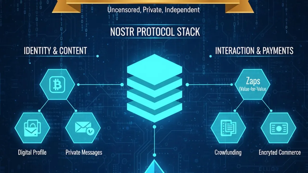
Nostr is easy to describe badly because public keys and relays sound like the whole story. They are not. The user experience depends on how the product handles event kinds, identifiers, signer requests, relay lists, media references, payment signals and app-specific data. Standards are the shared grammar, but the product still decides whether the grammar becomes readable.
That is also why a product can be both useful and limited. An app may implement the right standard for one job and ignore another job completely. That is not automatically a failure. It becomes a problem only when the product or the article implies broader portability than the implementation actually offers.
The page therefore connects standards to behavior. If the reader cannot see the consequence, the standard reference is not doing its job. The article explains the consequence first, then links the underlying document for anyone who wants to verify the claim.
The wrong first client teaches the wrong lesson
The main risk is simple: a bad first default can make the network look empty, confusing or broken even when the reader has simply landed in the wrong window. That risk does not make the category bad. It tells the reader where to slow down. Nostr rewards curiosity, but not every app deserves the same identity, wallet connection or trust budget on the first click.
The failure mode often appears as friction that looks small at first. A missing relay, a vague prompt, a stale repository, a closed feature, a broken media link, an unclear wallet budget or an unsupported event kind can turn into a larger trust problem when the reader starts depending on the product.
A fair article names those limits without drama. It does not punish young projects for being young. It does not hide risk behind enthusiasm either. If the source trail is thin, the text says so. If the product is strong but narrow, the text says that too. The reader can handle nuance when the page gives it plainly.
This is where the Apps hub becomes more than a catalog. It teaches a review habit. Look for the trust boundary, look for the source, look for the standard, look for what travels and look for what stays inside one product. That habit works across clients, wallets, publishing tools, marketplaces and developer infrastructure.
A sensible first-week path
A practical route starts here: create or connect a safe identity, follow known accounts, publish a harmless note, inspect relays, then open the same identity in a second client. This is not a rigid checklist. It is a way to avoid the most common mistake, which is opening many products without knowing which layer is being tested.
For a reader, the best next click is the page that answers the next concrete question. If the problem is identity, go to signers and key safety. If the problem is money, go to wallets, zaps and NWC. If the problem is writing, go to publishing. If the problem is source confidence, open the source trail. If the problem is implementation, go to the developer stack.
For a builder, the same route becomes a product audit. Which standards are actually implemented? Which events can another client read? Which permissions are asked at the right moment? Which docs or repositories prove the claim? Which parts are custom and need to be named clearly?
That is the reader promise of the Apps hub: it does not ask people to memorize the ecosystem. It gives them a route through it. Each article turns a confusing shelf of apps into a sequence of decisions that can be checked, compared and revisited as the Nostr market changes.
This route page is intentionally practical. A reader should not have to understand every NIP before seeing the basic loop. They need one client that lets them post, read, follow, reply and open a profile while gently exposing that the app is not the account.
The first week is a better test than the first minute. Empty feeds can fill once follows and relays are set. Confusing prompts can become clear after a signer page. Missing media may be an unsupported event kind. The route helps the reader slow down enough to diagnose the product instead of dismissing the protocol.
Three reader situations that change the answer
The first situation is the beginner who only wants a safe start. For that reader, start with a client is not an abstract category. It is a way to avoid the first bad decision. The useful answer is not a full market map. It is the smallest route that makes the next click understandable: what to try, what to avoid, which source to open and which part of the product is asking for trust.
The second situation is the regular Nostr user who already has a key, follows, relays and habits. That reader is not starting from zero. They want to know whether a polished mobile client, a web client with visible relay controls, a client with good discovery, and a second client used only for comparison can improve a real workflow without breaking something that already works. For them, the page has to talk about switching cost, data portability, product limits and whether the same identity behaves consistently across tools.
The third situation is the builder, operator, creator or researcher who reads the Apps hub as an evidence map. That reader cares about nostr.how client guidance, NostrApps, Nostr Compass, Nostorg comparison data and the official pages for the specific clients a reader is considering, but also about the gap between a claim and a working implementation. They may not use the app every day, yet they need to know which projects show the category clearly and which standards or repositories explain the behavior behind the interface.
Those three readers need different levels of detail, but they share one question: what can be trusted after the first impression fades? A good product surface may look simple, but the reader still needs to know what signs the event, where the data travels, what a wallet or relay can do, which source supports the claim and what happens when the user tries another app.
That is why the Apps hub keeps product pages, category pages, source pages and NIP references close together. The beginner can stay with the practical route. The experienced user can compare products. The builder can open the source trail. The same article serves all three only when it refuses to flatten the category into a single recommendation.
The trust boundary behind the product choice
Every Apps article eventually reaches a boundary. In this topic, the boundary is shaped by NIP-01, NIP-05, NIP-19, NIP-65, signer flows and the event kinds the client chooses to render well. Those standards do not make the product trustworthy by themselves, but they reveal what kind of promise the product is making. If the product signs, pays, publishes, relays, encrypts, lists, indexes or renders something, the reader needs to know where that action begins and where it stops.
The easiest mistake is to trust the visible surface more than the underlying boundary. A clean interface can still request too much key access. A familiar icon can still point to stale docs. A wallet button can still hide broad permissions. A beautiful publishing view can still store the useful parts in a private way. A developer repository can still be abandoned. None of that means the product is useless. It means the reader needs context before commitment.
The practical test is to separate four layers. First, what does the app show? Second, what does it sign, store, request or publish? Third, which other products can understand the result? Fourth, which source lets the reader verify the claim? When those layers are visible, a reader can make a calm choice. When they are blurred, the app may feel easier at first and more fragile later.
This is also where Nostr differs from a normal platform review. A centralized app review often asks whether the service is pleasant and trustworthy as a whole. A Nostr app review asks a more layered question: which part belongs to the user, which part belongs to the app, which part belongs to relays, which part belongs to a wallet or signer and which part belongs to a standard that other tools can share.
The category is strongest when a reader can leave without losing the important thing. That important thing changes by topic: identity, follows, content, payment context, group membership, media references, listing history, source evidence or implementation knowledge. The page keeps returning to that exit question because it is the quiet test behind most Nostr app choices.
How this topic connects to the rest of Apps
No Apps topic stands alone for long. Start With a Client quickly touches other routes because Nostr products overlap. A client may need a signer. A publishing tool may need media hosting. A marketplace may need private messaging and wallet flow. A creator app may need zaps, live events and archive storage. A developer tool may explain why a product feature works or fails.
For that reason, the next click is part of the content, not decoration. create or connect a safe identity, follow known accounts, publish a harmless note, inspect relays, then open the same identity in a second client. If that test raises a key question, the reader moves to signers. If it raises a payment question, they move to wallets and NWC. If it raises a standards question, they move to NIPs. If it raises a source question, they open the evidence trail. The route adapts to what the reader discovers.
The page also has to protect the wider map from confusion. Some products belong in more than one category. Alby can be read as wallet infrastructure, browser tooling and NWC context. Primal can be read as a client, wallet-adjacent surface and publishing reader. YakiHonne touches publishing and community. Mostro touches commerce, messaging and trust. The hub should show those overlaps without sending the reader in circles.
A useful overlap is not a duplicate. It is a reader path. When the same product appears from two routes, each page explains a different question: what the product does in this category, what source supports that description and what the reader needs to compare next. That is how a large Apps route stays navigable instead of becoming a pile of names.
The final result is simple from the outside. The reader starts with the job. The hub suggests the right kind of app. The article explains the trust boundary. The source list shows where the claim came from. The next route handles the adjacent question. That is the difference between a directory and a useful map.
Where the path leads next
After the first client, the next page should be signers. Then wallets and zaps. Then publishing, chat or developer tools depending on the reader goal. This order prevents the most common mistake: exploring every shiny app before understanding the key.
The Apps hub keeps this route visible so a beginner can ignore the full archive until they need it.
Sources worth opening
- nostr.how get started - Beginner path for keys, clients and first use.
- nostr.how clients - Beginner-friendly explanation of Nostr clients.
- Nostr Apps - Large app directory used as a discovery source for product categories.
- Nostorg client matrix - Client comparison matrix for platform and NIP support.
- Damus - iOS and macOS-oriented Nostr client.
- Amethyst GitHub - Android Nostr client source repository.
- Primal - Consumer Nostr client with feeds, wallet and publishing surfaces.
- Coracle - Web client focused on relay-aware social use.
- noStrudel - Web client for exploring Nostr through many event types.