The Product Face of Nostr Apps
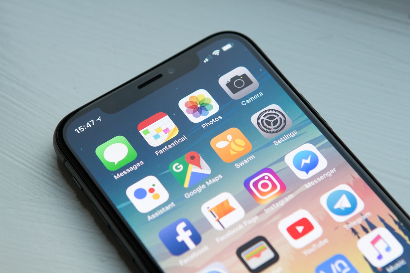
A favicon shelf is not decoration in a crowded Nostr ecosystem. It is the first recognition layer: a way to scan products quickly before opening the deeper profile, source trail and trust questions behind each name.
Why icons matter in an open ecosystem
Centralized platforms train users to recognize a small number of brands. Nostr has the opposite problem. There are many clients, signers, wallets, media tools, developer projects and experiments, and a reader may see unfamiliar names on every shelf. Text-only lists become tiring quickly. Icons give the eye a handle.
The icon is not proof of quality. It is orientation. A recognizable mark helps a reader find Alby, Damus, Primal, Amethyst, Coracle, noStrudel, Nostr Wallet Connect tools or a developer project in a dense hub. It also helps returning readers scan for a product they saw earlier. In a route with hundreds of pages, that speed matters.
This is why the Apps hub keeps favicon shelves. They serve the reader before the article begins. The article still has to do the serious work: explain what the app does, how it fits Nostr, what sources support it and what tradeoffs the user should understand.
A logo is not a recommendation
A clean icon can make a weak project look more finished than it is. An ugly or generic icon can hide a technically important tool. The hub must not confuse visual polish with trust. The icon shelf is a doorway, not an endorsement. Every product still needs a profile and source trail when a reader is making a real decision.
That distinction is especially important for signers and wallets. A friendly icon can sit beside a dangerous key-handling choice. A wallet-looking product can imply money safety without explaining custody or permissions. A developer library can look unimportant because it has no brand design while quietly powering serious apps. The product face starts recognition; it cannot finish evaluation.
The page therefore teaches readers to click through. If the decision touches keys, payments, identity, publishing or infrastructure, the icon is only the first clue.
Screenshots and product reality
Screenshots add another layer because they show how the app actually frames the user. Does the client look feed-first, article-first, wallet-first, community-first or developer-first? Does it expose relays? Does it show signer prompts clearly? Does it make zaps central or secondary? Does it feel like a polished consumer app or a tool for power users?
A screenshot can also age. Nostr apps move quickly, and visual surfaces change faster than protocol standards. That is why screenshots should be treated as context, not permanent proof. The stronger evidence remains the current website, repository, app-store listing and documentation.
Still, screenshots are valuable because they help readers understand product intent. A social client and a developer tool may both speak Nostr, but their screens reveal different assumptions about the user.
How the hub handles missing icons
Some important projects do not have stable favicons, polished marks or active websites. The hub should still include them when they matter. In those cases, a fallback icon or source-style mark is better than leaving a broken image. Broken icons create distrust and visual noise. A fallback keeps the shelf readable while the profile explains the source situation.
When a project has an official icon, the hub should use it carefully and avoid stretching, cropping or turning it into a fake endorsement badge. The icon should identify the product, not overpower the page. This is why the shelves use compact tiles with names and modest image treatment.
For a reader, the result should feel like a clear product shelf: quick to scan, organized by need, and supported by deeper cards when a choice matters.
What to open after the icon shelf
After finding a product visually, open the profile. Read what category it belongs to, which platforms it supports, where the source lives and which standards matter. If it is a client, compare signing and relay choices. If it is a signer, inspect key storage and permission flow. If it is a wallet, inspect custody and NWC behavior. If it is a developer tool, inspect the repository and maintenance signals.
The icon is the beginning of memory. The profile is where judgment begins. That two-step pattern is what lets the Apps hub stay broad without becoming shallow.
A serious Nostr wiki needs both: the friendliness of a visual product shelf and the discipline of researched pages behind every meaningful card.
Sources worth opening
- Nostr Apps - Directory of Nostr products grouped by use case and platform.
- Nostr Compass projects - Project directory with clients, wallets, signers, relays and developer tools.
- Damus - iOS client that helped make Nostr visible to mainstream mobile users.
- Primal - Consumer Nostr client and wallet surface.
- Coracle - Web client exploring relays, communities and social graph control.
- noStrudel - Web client and protocol-friendly Nostr interface.
- nostr-protocol/nips - Canonical standards repository for Nostr implementation proposals.